Course data
Data Final
The data we will be using for this course comes from USAFacts, who collated the data from various other sources. These data are not particularly granular. The smallest unit of analysis is schools, so you will have to think on a macro level about the types of questions you want to address. Full instructions to accessing the data are provided for you on canvas in the Files section (see here).
The purpose of this document is to walk you through a few files and discuss some of their properties. Let’s start by looking at the available files.
library(edld652)
list_datasets()
##  [1] "EDFacts_acgr_lea_2011_2019"
##  [2] "EDFacts_acgr_sch_2011_2019"
##  [3] "EDFacts_math_achievement_lea_2010_2019"
##  [4] "EDFacts_math_achievement_sch_2010_2019"
##  [5] "EDFacts_math_participation_lea_2013_2019"
##  [6] "EDFacts_math_participation_sch_2013_2019"
##  [7] "EDFacts_rla_achievement_lea_2010_2019"
##  [8] "EDFacts_rla_achievement_sch_2010_2019"
##  [9] "EDFacts_rla_participation_lea_2013_2019"
## [10] "EDFacts_rla_participation_sch_2013_2019"
## [11] "NCES_CCD_fiscal_district_2010"
## [12] "NCES_CCD_fiscal_district_2011"
## [13] "NCES_CCD_fiscal_district_2012"
## [14] "NCES_CCD_fiscal_district_2013"
## [15] "NCES_CCD_fiscal_district_2014"
## [16] "NCES_CCD_fiscal_district_2015"
## [17] "NCES_CCD_fiscal_district_2016"
## [18] "NCES_CCD_fiscal_district_2017"
## [19] "NCES_CCD_fiscal_district_2018"
## [20] "NCES_CCD_nonfiscal_district_2017_2021_directory"
## [21] "NCES_CCD_nonfiscal_district_2017_2021_disabilities"
## [22] "NCES_CCD_nonfiscal_district_2017_2021_english_learners"
## [23] "NCES_CCD_nonfiscal_district_2017_2021_membership"
## [24] "NCES_CCD_nonfiscal_district_2017_2021_staff"
## [25] "NCES_CCD_nonfiscal_school_2017_2020_lunch_program"
## [26] "NCES_CCD_nonfiscal_school_2017_2020_school_characteristics"
## [27] "NCES_CCD_nonfiscal_school_2017_2020_staff"
## [28] "NCES_CCD_nonfiscal_school_2017_2021_directory"
## [29] "NCES_CCD_nonfiscal_school_2017_membership"
## [30] "NCES_CCD_nonfiscal_school_2018_membership"
## [31] "NCES_CCD_nonfiscal_school_2019_membership"
## [32] "NCES_CCD_nonfiscal_school_2020_membership"
## [33] "NCES_CCD_nonfiscal_state_2017_2020_directory"
## [34] "NCES_CCD_nonfiscal_state_2017_2020_staff"
## [35] "NCES_CCD_nonfiscal_state_2017_2021_membership"
The names of these are not always super clear, and the variable names within the files are also regularly not straightforward. To start, anything that says lea is at the school district level, and anything that says sch or school is at the school level.
Data documentation
You can import any of these datasets and start to play around, but is highly encouraged that you also look at the corresponding documentation. Let’s actually start by looking at the documentation for "EDFacts_acgr_sch_2011_2019", which we know is at the school level, but otherwise it’s pretty unclear.
get_documentation("EDFacts_acgr_sch_2011_2019")
If you’re on a Mac, the above code will download the documentation for this file and put it in a data-documenation directory (folder) inside your current working directory (your R project) and automatically open the file (in Microsoft Word in this case, but some documentation is also in Excel). Unfortunately, Windows machines make this process more difficult, so if you’re on a Windows machine it will instead just print a link to the console that you can paste into your browser to get the documentation.
Scanning through this documentation we see that this file contains data (at the school level, given the file name) on the four-year adjusted-cohort graduation rates. According to the documentation, this is defined as
The four-year adjusted-cohort graduation rate is the number of students who graduate in four years with a regular high school diploma divided by the number of students who formed the cohort for that graduating class. The four-year adjusted cohort rate also includes students who graduate in less than four years.
Section 1.6 is also important. It describes steps taken to ensure that individual students cannot be identified in the directory. This entails two steps:
- Cells with 1-5 students are suppressed. These are coded
PS. - Medium sized groups are binned (e.g.
"< 20%"). The binning method depends on the size of the group. See Table 2 for more details.
Getting the data
Let’s go ahead and download the school district level version of this file, rather than schools, so it will be a bit quicker. Note that some of these datasets will take several minutes to download/import.
grad_rates <- get_data("EDFacts_acgr_lea_2011_2019")
grad_rates
## # A tibble: 11,326 × 29
##    ALL_COHORT ALL_RATE CWD_COHORT CWD_RATE DATE_CUR ECD_COHORT ECD_RATE FIPST
##         <dbl> <chr>         <dbl> <chr>    <chr>         <dbl> <chr>    <chr>
##  1        252 80                3 PS       03OCT15         121 65-69    01
##  2        398 75               47 70-79    03OCT15         233 65-69    01
##  3       1020 89               51 40-49    03OCT15         175 75-79    01
##  4        750 91               35 60-69    03OCT15         102 80-84    01
##  5        128 55-59            15 LT50     03OCT15          68 40-44    01
##  6        166 90-94             9 GE50     03OCT15          53 70-79    01
##  7        336 90               30 60-79    03OCT15          35 60-69    01
##  8        273 77               11 LT50     03OCT15          93 70-74    01
##  9        134 70-74             4 PS       03OCT15          60 50-59    01
## 10        266 58               33 50-59    03OCT15         195 55-59    01
## # … with 11,316 more rows, and 21 more variables: FILEURL <chr>, LEAID <chr>,
## #   LEANM <chr>, LEP_COHORT <dbl>, LEP_RATE <chr>, MAM_COHORT <dbl>,
## #   MAM_RATE <chr>, MAS_COHORT <dbl>, MAS_RATE <chr>, MBL_COHORT <dbl>,
## #   MBL_RATE <chr>, MHI_COHORT <dbl>, MHI_RATE <chr>, MTR_COHORT <dbl>,
## #   MTR_RATE <chr>, MWH_COHORT <dbl>, MWH_RATE <chr>, STNAM <chr>, YEAR <dbl>,
## #   PIPELINE <chr>, DL_INGESTION_DATETIME <dttm>
Tables 6 and 7 in the documentation describes the variable naming conventions used here. However, there are a few variables in this file that are not described in the documentation, most notably "FIPST", "LEAID", and "LEANM". These are going to be critical for joining other sources of data. The "FIPST" identifies the state, while the latter two identify the specific school district.
Adding in state information
There are many places where you can get a file linking the "FIPST" with the actual name. For example, there’s a file from Kieran Healy available here. Let’s actually use that file to merge in information about the states.
state_info <- readr::read_csv("https://github.com/kjhealy/fips-codes/raw/master/state_fips_master.csv")
state_info
## # A tibble: 50 × 10
##    state_name  state_abbr long_name       fips sumlev region division state
##    <chr>       <chr>      <chr>          <dbl>  <dbl>  <dbl>    <dbl> <dbl>
##  1 Alabama     AL         Alabama AL         1     40      3        6     1
##  2 Alaska      AK         Alaska AK          2     40      4        9     2
##  3 Arizona     AZ         Arizona AZ         4     40      4        8     4
##  4 Arkansas    AR         Arkansas AR        5     40      3        7     5
##  5 California  CA         California CA      6     40      4        9     6
##  6 Colorado    CO         Colorado CO        8     40      4        8     8
##  7 Connecticut CT         Connecticut CT     9     40      1        1     9
##  8 Delaware    DE         Delaware DE       10     40      3        5    10
##  9 Florida     FL         Florida FL        12     40      3        5    12
## 10 Georgia     GA         Georgia GA        13     40      3        5    13
## # … with 40 more rows, and 2 more variables: region_name <chr>,
## #   division_name <chr>
Note in the above I’m using readr to read in the CSV, and I’ve changed the link slight so it says "raw" instead of "blob". This is a general method you can use for reading in any CSV from GitHub.
Note that the FIPS is coded slightly differently in this file - it’s an integer So to join these files we should first change "FIPST" so it is also an integer
library(dplyr) # could also just load the entire tidyverse
grad_rates <- grad_rates %>%
  mutate(fips = readr::parse_number(FIPST))
And now we can join them.
grad_rates <- left_join(grad_rates, state_info)
## Joining, by = "fips"
grad_rates %>%
  select(state_name, ALL_RATE)
## # A tibble: 11,326 × 2
##    state_name ALL_RATE
##    <chr>      <chr>
##  1 Alabama    80
##  2 Alabama    75
##  3 Alabama    89
##  4 Alabama    91
##  5 Alabama    55-59
##  6 Alabama    90-94
##  7 Alabama    90
##  8 Alabama    77
##  9 Alabama    70-74
## 10 Alabama    58
## # … with 11,316 more rows
Joining other files
Let’s say we’re interested in visualizing how the total revenue for a district relates to
proportion of students classified as economically disadvantaged relates to the economically disadvantaged cohort graduation rate. For this, we would need to join in the lunch program dataset. Note that this takes several minutes to import (on my computer with my home internet connection).
fiscal_18 <- get_data("NCES_CCD_fiscal_district_2018")

# select only the variables we want
fiscal_18 <- fiscal_18 %>%
  select(FIPST, LEAID, TOTALREV)
fiscal_18
## # A tibble: 18,715 × 3
##    FIPST LEAID    TOTALREV
##    <chr> <chr>       <dbl>
##  1 01    0100002        -1
##  2 01    0100005  56909000
##  3 01    0100006  59036000
##  4 01    0100007 179516000
##  5 01    0100008 119390000
##  6 01    0100009        -1
##  7 01    0100011  20007000
##  8 01    0100012  25307000
##  9 01    0100013  53968000
## 10 01    0100015        -2
## # … with 18,705 more rows
Note that there are some instances where the total revenue appears to be suppressed. This is not covered in the documentation, so I’m unsure of what these negative values mean, but I can find out if there are groups interested in using this data. I’m going to go ahead and remove these from the file before the join. Then we’ll join the file with our grad_rates file and create a few plots.
grad_rates <- left_join(grad_rates, filter(fiscal_18, TOTALREV > 0))
grad_rates
## # A tibble: 11,326 × 40
##    ALL_COHORT ALL_RATE CWD_COHORT CWD_RATE DATE_CUR ECD_COHORT ECD_RATE FIPST
##         <dbl> <chr>         <dbl> <chr>    <chr>         <dbl> <chr>    <chr>
##  1        252 80                3 PS       03OCT15         121 65-69    01
##  2        398 75               47 70-79    03OCT15         233 65-69    01
##  3       1020 89               51 40-49    03OCT15         175 75-79    01
##  4        750 91               35 60-69    03OCT15         102 80-84    01
##  5        128 55-59            15 LT50     03OCT15          68 40-44    01
##  6        166 90-94             9 GE50     03OCT15          53 70-79    01
##  7        336 90               30 60-79    03OCT15          35 60-69    01
##  8        273 77               11 LT50     03OCT15          93 70-74    01
##  9        134 70-74             4 PS       03OCT15          60 50-59    01
## 10        266 58               33 50-59    03OCT15         195 55-59    01
## # … with 11,316 more rows, and 32 more variables: FILEURL <chr>, LEAID <chr>,
## #   LEANM <chr>, LEP_COHORT <dbl>, LEP_RATE <chr>, MAM_COHORT <dbl>,
## #   MAM_RATE <chr>, MAS_COHORT <dbl>, MAS_RATE <chr>, MBL_COHORT <dbl>,
## #   MBL_RATE <chr>, MHI_COHORT <dbl>, MHI_RATE <chr>, MTR_COHORT <dbl>,
## #   MTR_RATE <chr>, MWH_COHORT <dbl>, MWH_RATE <chr>, STNAM <chr>, YEAR <dbl>,
## #   PIPELINE <chr>, DL_INGESTION_DATETIME <dttm>, fips <dbl>, state_name <chr>,
## #   state_abbr <chr>, long_name <chr>, sumlev <dbl>, region <dbl>, …
Let’s create an overall scatterplot to start.
library(ggplot2)
theme_set(theme_minimal(15))

ggplot(grad_rates, aes(TOTALREV, ALL_RATE)) +
  geom_point()
## Warning: Removed 488 rows containing missing values (geom_point).
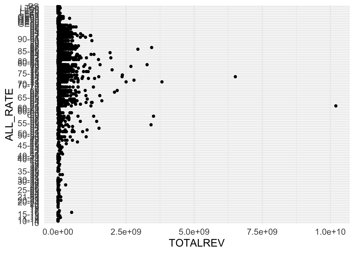
Wow! That is really not helpful! The problem here is the binning of the Cohort Graduation rate. Let’s transform this to an approximately numeric scale by putting the rate in the middle of the range, if there is a range, and otherwise taking the exact percent.
grad_rates %>%
  count(ALL_RATE)
## # A tibble: 127 × 2
##    ALL_RATE     n
##    <chr>    <int>
##  1 10           1
##  2 10-14       14
##  3 11-19       12
##  4 12           1
##  5 13           2
##  6 15-19       12
##  7 16           5
##  8 17           2
##  9 18           1
## 10 19           1
## # … with 117 more rows
Above is a small section of all the rates. Let’s split this column based on the "-" character. There are many ways to do this, but probably the most straightforward way with the tidyverse would be
grad_rates %>%
  count(ALL_RATE) %>%
  tidyr::separate(ALL_RATE, c("lower", "upper"), sep = "-")
## Warning: Expected 2 pieces. Missing pieces filled with `NA` in 98 rows [1, 4, 5,
## 7, 8, 9, 10, 11, 12, 15, 17, 18, 19, 21, 22, 23, 24, 27, 28, 29, ...].
## # A tibble: 127 × 3
##    lower upper     n
##    <chr> <chr> <int>
##  1 10    <NA>      1
##  2 10    14       14
##  3 11    19       12
##  4 12    <NA>      1
##  5 13    <NA>      2
##  6 15    19       12
##  7 16    <NA>      5
##  8 17    <NA>      2
##  9 18    <NA>      1
## 10 19    <NA>      1
## # … with 117 more rows
We get a warning because there are many cases where the range is not binned. Let’s now drop any cases that cannot easily be transformed to numeric (e.g., "GE50", "PS"), fill in the missing values with the lower value, then calculate the mean. Note when I calculate the mean, I have to do so rowwise().
grad_rates %>%
  count(ALL_RATE) %>%
  tidyr::separate(ALL_RATE, c("lower", "upper"), sep = "-") %>%
  filter(!grepl("G|L|P", lower)) %>%
  mutate(
    upper = ifelse(is.na(upper), lower, upper),
    lower = as.numeric(lower),
    upper = as.numeric(upper)
  ) %>%
  rowwise() %>%
  mutate(mean = mean(c(lower, upper))) %>%
  ungroup()
## Warning: Expected 2 pieces. Missing pieces filled with `NA` in 98 rows [1, 4, 5,
## 7, 8, 9, 10, 11, 12, 15, 17, 18, 19, 21, 22, 23, 24, 27, 28, 29, ...].
## # A tibble: 116 × 4
##    lower upper     n  mean
##    <dbl> <dbl> <int> <dbl>
##  1    10    10     1    10
##  2    10    14    14    12
##  3    11    19    12    15
##  4    12    12     1    12
##  5    13    13     2    13
##  6    15    19    12    17
##  7    16    16     5    16
##  8    17    17     2    17
##  9    18    18     1    18
## 10    19    19     1    19
## # … with 106 more rows
Perfect! Note - if you don’t fully follow all of the above right now, that’s okay. It’s a bit complicated. It’s also not done. We were using count() to basically verify that it wa all working, but now we need to do the same thing to our actual dataframe.
grad_rates <- grad_rates %>%
  tidyr::separate(ALL_RATE, c("lower", "upper"), sep = "-") %>%
  filter(!grepl("G|L|P", lower)) %>%
  mutate(
    upper = ifelse(is.na(upper), lower, upper),
    lower = as.numeric(lower),
    upper = as.numeric(upper)
  ) %>%
  rowwise() %>%
  mutate(mean = mean(c(lower, upper))) %>%
  ungroup()
## Warning: Expected 2 pieces. Missing pieces filled with `NA` in 6958 rows [1, 2,
## 3, 4, 7, 8, 10, 11, 12, 13, 14, 15, 16, 18, 19, 20, 21, 24, 25, 26, ...].
And now we can try our original plot again.
ggplot(grad_rates, aes(TOTALREV, mean)) +
  geom_point()
## Warning: Removed 296 rows containing missing values (geom_point).
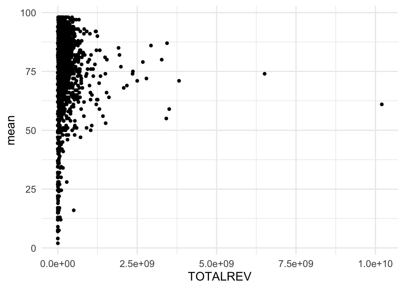
Note that we have a lot of data that is bunched up near the bottom. Let’s try a log transformation of the x-axis.
ggplot(grad_rates, aes(TOTALREV, mean)) +
  geom_point() +
  scale_x_log10()
## Warning: Removed 296 rows containing missing values (geom_point).
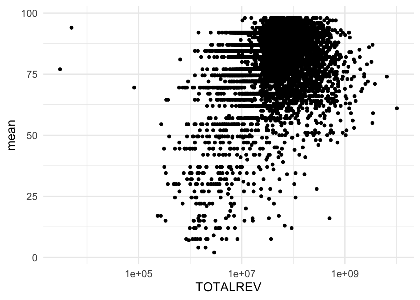
This is a bit more helpful, but let’s make the x-axis more interpretable.
ggplot(grad_rates, aes(TOTALREV, mean)) +
  geom_point() +
  scale_x_log10(labels = scales::dollar)
## Warning: Removed 296 rows containing missing values (geom_point).
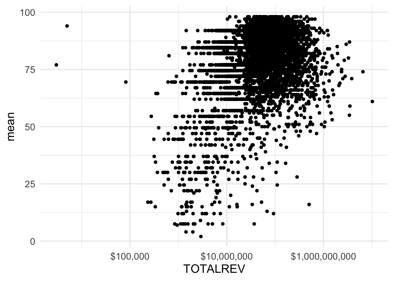
Better.Let’s go ahead and finish styling the plot a bit to make it even more clear.
ggplot(grad_rates, aes(TOTALREV, mean)) +
  geom_point(
    stroke = 0,
    alpha = 0.3,
    color = "gray20",
    size = 2
  ) +
  scale_x_log10("Total District Revenue", labels = scales::dollar) +
  labs(
    y = "Approximate average graduation rate",
    title = stringr::str_wrap("School districts with higher total revenue generally have higher graduation rates", 60),
    subtitle = "Each point represents a school district",
    caption = "Note the log transformation of the x-axis"
  ) +
  theme(plot.title.position = "plot")
## Warning: Removed 296 rows containing missing values (geom_point).
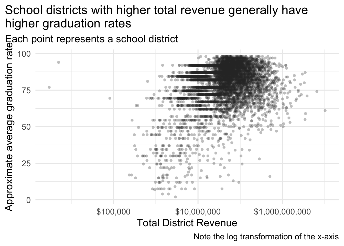
One last example, maybe we want to see this relation by state. We could try something like facet_wrap() but that is likely to be unmanageably large and take a lot of mental processing to track across each state. Instead, we can use the geofacet package to arrange the facets according to the basic geography of the US. For example
library(geofacet)

grad_rates %>%
  tidyr::drop_na(state_abbr) %>%
ggplot(aes(TOTALREV, mean)) +
  geom_point(
    stroke = 0,
    alpha = 0.3,
    color = "gray20",
    size = 2
  ) +
  facet_geo(~state_abbr) +
  scale_x_log10("Total District Revenue", labels = scales::dollar) +
  labs(
    y = "Approximate average graduation rate",
    title = stringr::str_wrap("School districts with higher total revenue generally have higher graduation rates", 60),
    subtitle = "Each point represents a school district",
    caption = "Note the log transformation of the x-axis"
  ) +
  theme(
    plot.title.position = "plot",
    axis.text.x = element_blank()
  )
## Warning: Removed 258 rows containing missing values (geom_point).
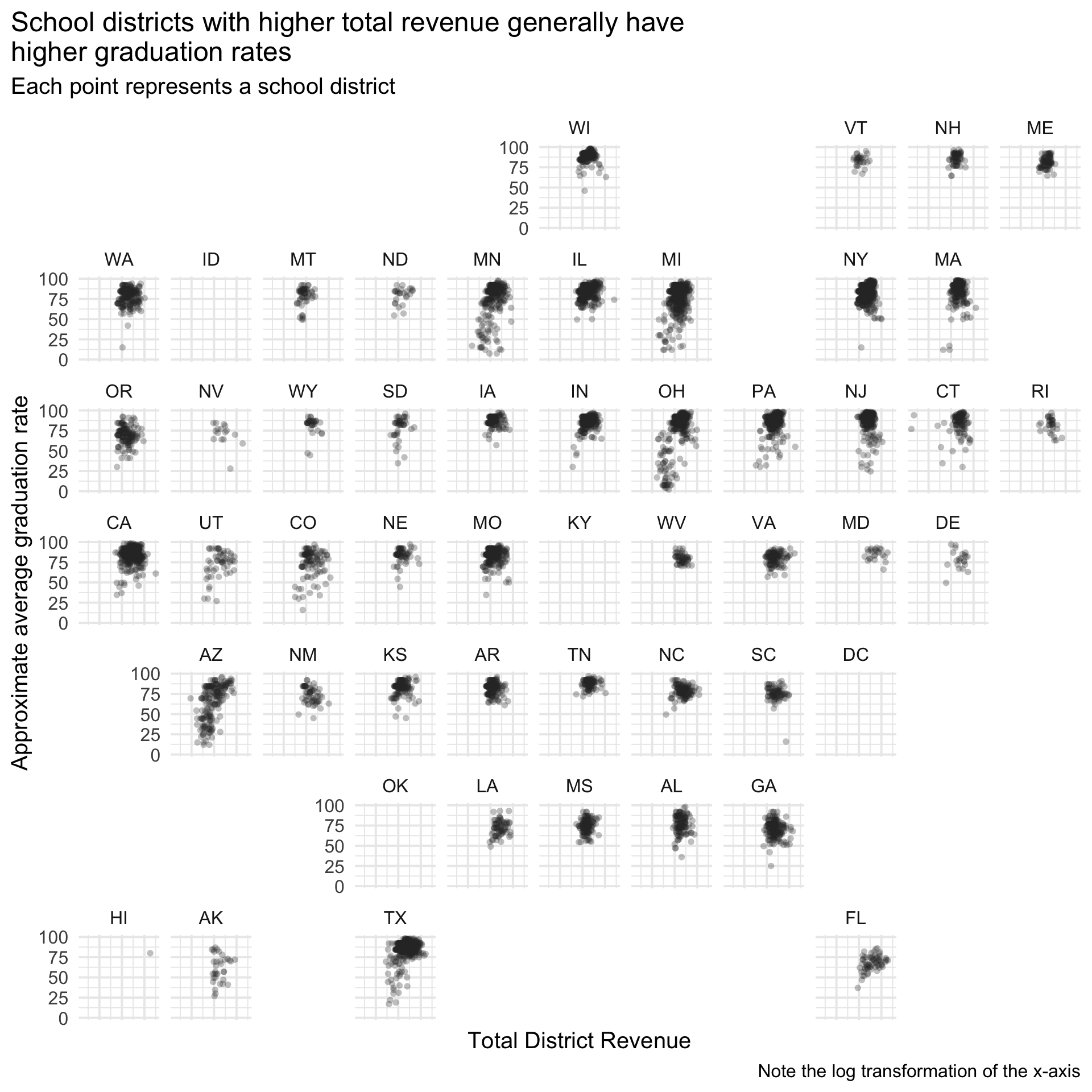
This was obviously very quick, and I omitted the x-axis labels entirely (not a good idea), but gives you a basic idea of some of what you can do. Note that the best visual will often depend on the medium, which is why we cover both in this class, and this is an example of a good visual but not for this medium, because the margins of the website end up squishing the figure too much. Later in the course, we’ll learn about distill which has some nice options for handling this sort of thing.