Homework
Homework
Background
For this homework we will again use data from #tidytuesday, as well as from Kaggle, this time looking at data on transit costs (from #tidytuesday) and crime rates in Denver, CO (from Kaggle). We will be using the crime.csv file from Kaggle.
Please visit each of the previous links for more information on each data source.
git/GitHub
Use of git/GitHub is optional for this homework. However, I encourage you to use these tools to help you become more fluent with them, and in particular their use in collaborating. I am therefore offering a small amount of extra credit (3 points) for all group members who complete this homework collaboratively. To obtain the three points extra credit, you must:
- Have more than two group members
- Use branching
- Use issues
- Have evidence in your commit history that all members contributed to the homework roughly equally
This is optional, but will provide you a small amount of “buffer” if you happen to lose points elsewhere on the lab.
Getting Started
You can download the tidytuesday data using one of the following approaches:
library(tidyverse)

transit_cost <- read_csv('https://raw.githubusercontent.com/rfordatascience/tidytuesday/master/data/2021/2021-01-05/transit_cost.csv')

# install.packages("tidytuesdayR")
transit_cost <- tidytuesdayR::tt_load(2021, week = 2)
The Kaggle data can be downloaded either directly from Kaggle or from canvas (it was too large to post on GitHub). Note that if you do download the data directly from Kaggle your plots may not match mine exactly, given that the data are updated daily.
Assignment
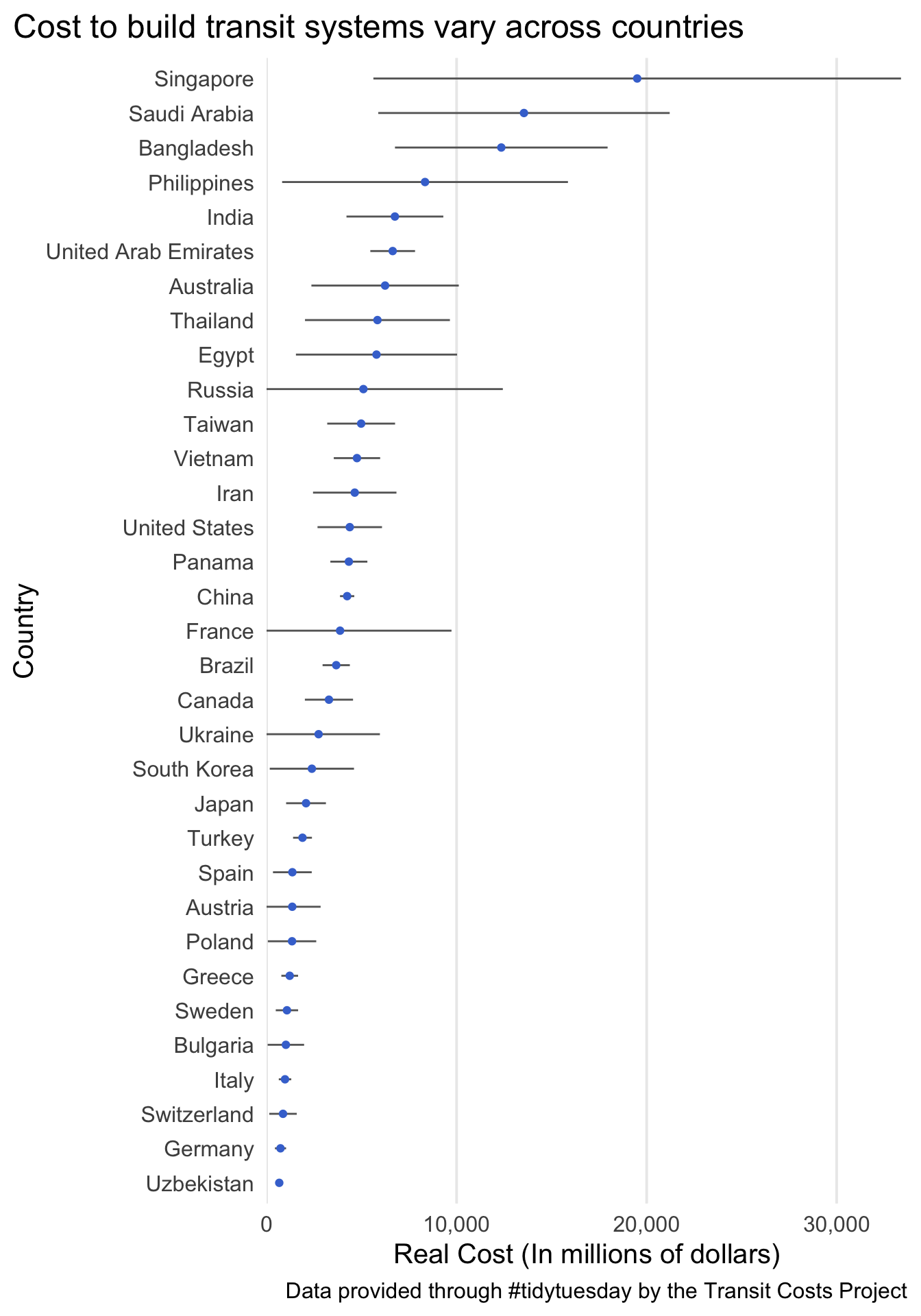
Question 1
Use the transit costs data to reproduce the following plot. To do so, you will need to do a small amount of data cleaning, then calculate the means and standard errors (of the mean) for each country. Please filter to only counties with at least three observations. To use actual country names, rather than abbreviations, join your dataset with the output from the following
install.packages("countrycode")
country_codes <- countrycode::codelist %>%
  select(country_name = country.name.en, country = ecb)
As typical, the reproduction does not need to be identical, just close.
Question 2
Visualize the same relation, but displaying the uncertainty using an alternative method of your choosing.
Question 3
Compute the mean length and real_cost by city. Reproduce the following plot.
- Hint: Look into
scale_size_binned()

Question 4
Using basically the same data, reproduce the following plot. Note you’ll need the country_name column in your dataset.

Question 5
Use the crime dataset to run the following code and fit the corresponding model. Note, it may take a moment to run.
model_data <- crime %>%
  mutate(neighborhood_id = relevel(factor(neighborhood_id), ref = "barnum"))

m <- glm(is_crime ~ neighborhood_id,
         data = model_data,
         family = "binomial")
This model uses neighborhood to predict whether a crime occurred or not. The reference group has been set to the “barnum” neighborhood, and the coefficents are all in comparison to this neighborhood.
Extract the output using broom::tidy
tidied <- broom::tidy(m)
Divide the probability space, [0, 1], into even bins of your choosing. For example, for 20 bins I could run the following
ppoints(20)
##  [1] 0.025 0.075 0.125 0.175 0.225 0.275 0.325 0.375 0.425 0.475 0.525 0.575
## [13] 0.625 0.675 0.725 0.775 0.825 0.875 0.925 0.975
The coefficients (tidied$estimate) for each district in the model represent the difference in crime rates between the corresponding neighborhood the Barnum neighborhood. These are reported on a log scale and can be exponentiated to provide the odds. For example the Athmar-Park neighborhood was estimated as 1.13 times more likely to have a crime occur than the Barnum neighborhood. This is the point estimate, which is our “best guess” as to the true difference, and the likelihood of alternative differences are distributed around this point with a standard deviation equal to the standard error. We can simulate data from this distribution, if we choose, or instead just use the distribution to calculate different quantiles.
The qnorm function transforms probabilities, such as those we generated with ppoints, into values according to some pre-defined normal distribution (by default it is a standard normal with a mean of zero and standard deviation of 1). For example qnorm(.75, mean = 100, sd = 10) provides the 75th percentile value from a distribution with a mean of 100 and a standard deviation of 10. We can therefore use qnorm in conjunction with ppoints to better understand the sampling distribution and, ultimately, communicate uncertainty. For example the following code generates the values corresponding to ppoints(20), or 2.5th to 97.5th percentiles of the distributions in 5 percentile “jumps”, for the difference in crime rates on the log scale for Barnum and Regis neighborhoods.
regis <- tidied %>%
  filter(term == "neighborhood_idregis")

qnorm(ppoints(20),
      mean = regis$estimate,
      sd = regis$std.error)
##  [1] -0.137665770 -0.106700622 -0.089494614 -0.076657132 -0.065996465
##  [6] -0.056616176 -0.048048461 -0.040008805 -0.032302456 -0.024781105
## [11] -0.017319140 -0.009797789 -0.002091440  0.005948216  0.014515931
## [16]  0.023896220  0.034556887  0.047394369  0.064600377  0.095565525
The following plot displays a discretized version of the probability space for the differences in crime between the neighborhoods. Replicate this plot, but comparing the Barnum neighborhood to the Barnum-West neighborhood. Make sure to put the values in a data frame, and create a new variable stating whether the difference is greater than zero (which you will use to fill by). Note that you do not need to replicate the colors in the subtitle to match the balls, as I have, but if you’d like to you should likely use the ggtext package.
Note: Your probabilities will not directly correspond with the p values, which are essentially twice the probability you are displaying (because the test is two-tailed).
