class: center, middle, inverse, title-slide # Refining your plots ### Daniel Anderson ### Week 6 --- layout: true <script> feather.replace() </script> <div class="slides-footer"> <span> <a class = "footer-icon-link" href = "https://github.com/uo-datasci-specialization/c2-dataviz-2022/raw/main/static/slides/w6.pdf"> <i class = "footer-icon" data-feather="download"></i> </a> <a class = "footer-icon-link" href = "https://dataviz-2022.netlify.app/slides/w6.html"> <i class = "footer-icon" data-feather="link"></i> </a> <a class = "footer-icon-link" href = "https://github.com/uo-datasci-specialization/c2-dataviz-2022"> <i class = "footer-icon" data-feather="github"></i> </a> </span> </div> --- class: inverse-blue # Data viz in Wild Eliott Merly Esme ### Cassie, Amy, and Diana on deck --- class: inverse-red middle # Reviewing Lab 3 --- # Agenda * Introduce the homework (I expect you won't know how to do much of it currently) * Aspect ratios, scales, and labels * Quick break (no lab, so all lecture today) * Annotations (most of the day) * Saving plots (pretty quick) * Compound figures (also pretty quick) * Themes (quickly) -- Because we don't have a lab today, I'll be asking you to complete small "challenges" throughout. Please get R up and running if you haven't already. --- # Learning Objectives * Understand how to make a wide variety of tweaks to ggplot. * Understand common modifications to plots to make them more clear and reduce cognitive load + And ways to implement them -- A warning - I don't expect we'll get through everything today --- class:inverse-orange # Homework --- # Axes * Cartesian coordinates - what we generally use <!-- --> --- # Different units <!-- --> --- # Aspect ratio <!-- --> --- background-image: url("http://socviz.co/dataviz-pdfl_files/figure-html4/ch-01-perception-curves-1.png") background-size: contain --- # Same scales Use `coord_fixed()` <!-- --> -- Note - I think this is a weird plot, but the point remains --- # Changing aspect ratio * Explore how your plot will look in its final size * No hard/fast rules (if on different scales) * Not even really rules of thumb * Keep visual perception in mind * Try your best to be truthful - show the trend/relation, but don't exaggerate/hide it --- # Handy function (from an apparently deleted tweet from [@tjmahr](https://twitter.com/tjmahr)) <blockquote class="twitter-tweet tw-align-center" data-lang="en"><p lang="en" dir="ltr">here's my favorite helper <a href="https://twitter.com/hashtag/rstats?src=hash&ref_src=twsrc%5Etfw">#rstats</a> function. preview ggsave() output<br><br>ggpreview <- function (..., device = "png") {<br> fname <- tempfile(fileext = paste0(".", device))<br> ggplot2::ggsave(filename = fname, device = device, ...)<br> system2("open", fname)<br> invisible(NULL)<br>}</p>— tj mahr 🍕🍍 (@tjmahr) </blockquote> --- # Gist (side note: gists are a good way to share things) * See the full code/example [here](https://gist.github.com/tjmahr/1dd36d78ecb3cff10baf01817a56e895) * Let's take 3 minutes to play around: + Create a plot (could even be the example in the gist) + Try different aspect ratios by changing the width/length <div class="countdown" id="timer_6206bc78" style="right:0;bottom:0;" data-warnwhen="0"> <code class="countdown-time"><span class="countdown-digits minutes">03</span><span class="countdown-digits colon">:</span><span class="countdown-digits seconds">00</span></code> </div> --- class: inverse-orange middle # Scale transformations --- # Raw scale ```r library(gapminder) ggplot(gapminder, aes(year, gdpPercap)) + geom_line(aes(group = country), color = "gray70") ``` <!-- --> --- ### Log10 scale ```r ggplot(gapminder, aes(year, gdpPercap)) + geom_line(aes(group = country), color = "gray70") + * scale_y_log10(labels = scales::dollar) ``` <!-- --> --- <br/> <br/> <!-- --> --- <br/> <br/> <!-- --> --- # Scales ```r d <- tibble(x = c(1, 3.16, 10, 31.6, 100), log_x = log10(x)) ggplot(d, aes(x, 1)) + geom_point(color = "#0072B2") ggplot(d, aes(x, 1)) + geom_point(color = "#0072B2") + scale_x_log10() ggplot(d, aes(log_x, 1)) + geom_point(color = "#0072B2") ``` --- # Scales  --- # Don't transform twice <style type="text/css"> .code-bg-red .remark-code, .code-bg-red .remark-code * { background-color: #ffe0e0 !important; } </style> .code-bg-red[ ```r ggplot(d, aes(log_x, 1)) + geom_point(color = "#0072B2") + scale_x_log10() + xlim(-0.2, 2.5) ``` <!-- --> ] --- # Careful with labeling * Has the scale or the data been log transformed? * Specify the base ```r library(ggtext) ggplot(d, aes(log_x, 1)) + geom_point(color = "#0072B2") + * labs(x = "log<sub>10</sub>(x)") + * theme(axis.title.x = element_markdown()) ``` <!-- --> Labels should denote the data, not the scale of the axis --- ```r ggplot(d, aes(x, 1)) + geom_point(color = "#0072B2") + * scale_x_log10() ``` <!-- --> Labeling the above with `\(log_{10}(x)\)` would be ambiguous and confusing --- # Interpretation Log scales show relative numbers, not raw -- Difference between 100 and 101 (1% change) will be much smaller than difference between 1 and 2 (100% change) -- More resources to learn more * [Blog post by Lisa Charlotte Muth](https://blog.datawrapper.de/weeklychart-logscale/) * The "Logorithmic or Linear scales" section [here](https://ig.ft.com/coronavirus-chart/?areas=usa&areas=gbr&areasRegional=usny&areasRegional=usnh&areasRegional=uspr&areasRegional=usdc&areasRegional=usfl&areasRegional=usmi&cumulative=0&logScale=1&per100K=1&startDate=2021-06-01&values=deaths) --- class: inverse-blue center middle # Labels and captions --- # Disclaimer * APA style requires the labels be made in specific ways * Much of the following discussion still applies * Our book (Wilke) uses a similar style throughout --- # Title ### What is the point of your figure? -- ### What are you trying to communicate -- * Figures should have only one title -- * Use integrated title/subtitles for sharing with a broad audience + Blog posts + Social media + Reports to stakeholders -- * Make sure your figure has a title + Should not start with "This figure displays/shows..." --- # Caption Consider stating the data source Other details relevant to the figure but not important enough for a subtitle --- # Axis labels * The title for the axis * Critical for communication * **Never** use variable names (very common and very poor practice) * State the measure and the unit (if quantitative) + e.g., "Brain Mass (grams)", "Support for Measure (millions of people)", "Dollars spent" + Categorical variable likely will not need to the measurement unit --- # Omission * Consider omitting obvious or redundant labels + Use `labs(x = NULL)` or `labs(x = "")` + If already using `scale_x/y_*()` just supply the `name` argument <!-- --> --- # Omission * Do not omit axis titles that are not obvious <!-- --> --- # Don't overdo it <!-- --> --- # Practice Let's use the `ggplot2::diamonds` dataset. * Plot the relationship between `carat` and `price` * Play with scale transformations * Give it some good labels * Make any other modifications you'd like that you think makes it prettier and/or easier to interpret. <div class="countdown" id="timer_6206bc0a" style="right:0;bottom:0;" data-warnwhen="0"> <code class="countdown-time"><span class="countdown-digits minutes">05</span><span class="countdown-digits colon">:</span><span class="countdown-digits seconds">00</span></code> </div> --- class: inverse-blue middle # Break <div class="countdown" id="timer_6206bb41" style="right:0;bottom:0;" data-warnwhen="0"> <code class="countdown-time"><span class="countdown-digits minutes">05</span><span class="countdown-digits colon">:</span><span class="countdown-digits seconds">00</span></code> </div> --- class: inverse-red center middle # Annotations The big topic for the day --- # Among the most effective * If possible, try to remove legends, and just include annotations -- * Warning - this is often fairly difficult in ggplot (requires a lot of fiddling) -- * Consider saving and making final annotations outside of R + Bad for reproducibility, but good for interpretability -- * There are some packages that can help --- # Building up a plot ```r remotes::install_github("clauswilke/dviz.supp") head(tech_stocks) ``` ``` ## # A tibble: 6 × 6 ## company ticker date price index_price price_indexed ## <chr> <chr> <date> <dbl> <dbl> <dbl> ## 1 Alphabet GOOG 2017-06-02 975.6 285.2 342.0757 ## 2 Alphabet GOOG 2017-06-01 966.95 285.2 339.0428 ## 3 Alphabet GOOG 2017-05-31 964.86 285.2 338.3100 ## 4 Alphabet GOOG 2017-05-30 975.88 285.2 342.1739 ## 5 Alphabet GOOG 2017-05-26 971.47 285.2 340.6276 ## 6 Alphabet GOOG 2017-05-25 969.54 285.2 339.9509 ``` --- ```r ggplot(tech_stocks, aes(date, price_indexed, color = ticker)) + geom_line() ``` <!-- --> --- ```r ggplot(tech_stocks, aes(date, price_indexed, color = ticker)) + geom_line() + * scale_color_OkabeIto() ``` <!-- --> --- ```r ggplot(tech_stocks, aes(date, price_indexed, color = ticker)) + geom_line() + scale_color_OkabeIto( * name = "Company", * breaks = c("GOOG", "AAPL", "FB", "MSFT"), * labels = c("Alphabet", "Apple", "Facebook", "Microsoft") ) ``` --- # Bad <!-- --> --- ```r ggplot(tech_stocks, aes(date, price_indexed, color = ticker)) + geom_line() + scale_color_OkabeIto( * name = "Company", * breaks = c("FB", "GOOG", "MSFT", "AAPL"), * labels = c("Facebook", "Alphabet", "Microsoft", "Apple") ) ``` --- # Good <!-- --> --- ```r ggplot(tech_stocks, aes(date, price_indexed, color = ticker)) + geom_line() + scale_color_OkabeIto( name = "Company", breaks = c("FB", "GOOG", "MSFT", "AAPL"), labels = c("Facebook", "Alphabet", "Microsoft", "Apple") ) + scale_x_date( name = "year", limits = c(ymd("2012-06-01"), ymd("2018-12-31")), expand = c(0,0) ) + geom_text( data = filter(tech_stocks, date == "2017-06-02"), aes(y = price_indexed, label = company), * nudge_x = 20 ) ``` --- <!-- --> --- ```r ggplot(tech_stocks, aes(date, price_indexed, color = ticker)) + geom_line() + scale_color_OkabeIto( name = "Company", breaks = c("FB", "GOOG", "MSFT", "AAPL"), labels = c("Facebook", "Alphabet", "Microsoft", "Apple") ) + scale_x_date( name = "year", limits = c(ymd("2012-06-01"), ymd("2018-12-31")), expand = c(0,0) ) + geom_text( data = filter(tech_stocks, date == "2017-06-02"), aes(y = price_indexed, label = company), nudge_x = 20, * hjust = 0, * size = 12 ) ``` --- <!-- --> --- ```r ggplot(tech_stocks, aes(date, price_indexed, color = ticker)) + geom_line() + scale_color_OkabeIto( name = "Company", breaks = c("FB", "GOOG", "MSFT", "AAPL"), labels = c("Facebook", "Alphabet", "Microsoft", "Apple") ) + scale_x_date( name = "year", limits = c(ymd("2012-06-01"), ymd("2018-12-31")), expand = c(0,0) ) + geom_text( data = filter(tech_stocks, date == "2017-06-02"), aes(y = price_indexed, label = company), nudge_x = 20, hjust = 0, size = 12 ) + * guides(color = "none") ``` --- <!-- --> --- ```r ggplot(tech_stocks, aes(date, price_indexed, color = ticker)) + geom_line() + scale_color_OkabeIto( name = "Company", breaks = c("FB", "GOOG", "MSFT", "AAPL"), labels = c("Facebook", "Alphabet", "Microsoft", "Apple") ) + scale_x_date( name = "year", limits = c(ymd("2012-06-01"), ymd("2018-12-31")), expand = c(0,0) ) + geom_text( data = filter(tech_stocks, date == "2017-06-02"), aes(y = price_indexed, label = company), nudge_x = 20, hjust = 0, size = 12 ) + guides(color = "none") + labs( * title = "Tech growth over time", * caption = "Data from Wilke (2019): Fundamentals of Data Visualization", * y = "Stock Price (Indexed)" ) ``` --- <!-- --> --- # A few more notes * You might want to try `geom_label()` instead of `geom_text()`, or perhaps layering them with the first providing the white space for the second (as we saw in Lab 2) * Could consider not making the font color vary with the lines (the labels are close enough) * Depending on you you use the legend, it can work almost as well. --- # Example From an actual publication, where I used the legend instead of direct annotations <img src="img/legend-example.png" alt="Line plot with legend annotation" width="550"/> --- # Labeling bars ```r avs <- tech_stocks %>% group_by(company) %>% summarize(stock_av = mean(price_indexed)) %>% ungroup() %>% mutate(share = stock_av / sum(stock_av)) avs ``` ``` ## # A tibble: 4 × 3 ## company stock_av share ## <chr> <dbl> <dbl> ## 1 Alphabet 141.0205 0.2292441 ## 2 Apple 77.08241 0.1253058 ## 3 Facebook 274.7427 0.4466240 ## 4 Microsoft 122.3088 0.1988261 ``` --- # Bar plot ```r ggplot(avs, aes(fct_reorder(company, share), share)) + geom_col(fill = "#0072B2") ``` <!-- --> --- # Horizontal ```r ggplot(avs, aes(share, fct_reorder(company, share))) + geom_col(fill = "#0072B2", alpha = 0.9) ``` <!-- --> --- ```r ggplot(avs, aes(share, fct_reorder(company, share))) + geom_col(fill = "#0072B2", alpha = 0.9) + theme( * panel.grid.major.y = element_blank(), * panel.grid.minor.x = element_blank(), * panel.grid.major.x = element_line(color = "gray80") ) ``` <!-- --> --- # Quick aside Let's actually make a bar plot theme ```r bp_theme <- function(...) { theme_minimal(...) + theme( panel.grid.major.y = element_blank(), panel.grid.minor.x = element_blank(), panel.grid.major.x = element_line(color = "gray80"), plot.title.position = "plot" ) } ``` --- ```r ggplot(avs, aes(share, fct_reorder(company, share))) + geom_col(fill = "#0072B2",alpha = 0.9) + geom_text( * aes(share, company, label = round(share, 2)), * nudge_x = 0.02, * size = 8 ) + bp_theme(base_size = 25) ``` <!-- --> --- ```r ggplot(avs, aes(share, fct_reorder(company, share))) + geom_col(fill = "#0072B2", alpha = 0.9) + geom_text( * aes(share, company, label = paste0(round(share*100), "%")), nudge_x = 0.02, size = 8 ) + scale_x_continuous( name = "Market Share", * labels = scales::percent ) + labs( x = NULL, title = "Tech company market control", caption = "Data from Clause Wilke Book: Fundamentals of Data Visualizations" ) + bp_theme(base_size = 25) ``` --- <!-- --> --- # Another alternative ```r ggplot(avs, aes(share, fct_reorder(company, share))) + geom_col(fill = "#0072B2", alpha = 0.9) + geom_text( aes(share, company, label = paste0(round(share*100), "%")), * nudge_x = -0.02, size = 8, * color = "white" ) + scale_x_continuous( "Market Share", labels = scales::percent, expand = c(0, 0, 0.05, 0) ) + labs( x = NULL, title = "Tech company market control", caption = "Data from Clause Wilke Book: Fundamentals of Data Visualizations" ) + bp_theme(base_size = 25) ``` --- <!-- --> --- # Last example This is a bit artificial in this case, but... -- It is very common to have small bars. You may want most labels inside, but some outside --- First, create variables specifying what you want. Here I'm using 0.2 as my cutoff for whether the label is inside the bar or outside ```r avs <- avs %>% mutate( nudge_amount = ifelse(share < 0.2, 0.02, -0.02), label_color = ifelse(share < 0.2, "black", "white") ) avs ``` ``` ## # A tibble: 4 × 5 ## company stock_av share nudge_amount label_color ## <chr> <dbl> <dbl> <dbl> <chr> ## 1 Alphabet 141.0205 0.2292441 -0.02 white ## 2 Apple 77.08241 0.1253058 0.02 black ## 3 Facebook 274.7427 0.4466240 -0.02 white ## 4 Microsoft 122.3088 0.1988261 0.02 black ``` --- `nudge_*` doesn't work inside aes 🤷♂️ ```r ggplot(avs, aes(share, fct_reorder(company, share))) + geom_col(fill = "#0072B2", alpha = 0.9) + geom_text( aes( share, company, label = paste0(round(share*100), "%"), * color = label_color ), * nudge_x = avs$nudge_amount, size = 8, ) + scale_x_continuous( "Market Share", labels = scales::percent, expand = c(0, 0, 0.05, 0) ) + * scale_color_identity() + labs( x = NULL, title = "Tech company market control", caption = "Data from Clause Wilke Book: Fundamentals of Data Visualizations" ) + bp_theme(base_size = 25) ``` --- <!-- --> --- # Distributions ```r ggplot(iris, aes(Sepal.Length, fill = Species)) + geom_density(alpha = 0.3, color = "white") ``` <!-- --> --- ```r ggplot(iris, aes(Sepal.Length, fill = Species)) + geom_density(alpha = 0.3, color = "white") + scale_fill_OkabeIto() ``` <!-- --> --- # Labeling ### One method ```r label_locs <- tibble(Sepal.Length = c(5.45, 6, 7), density = c(1, 0.8, 0.6), Species = c("setosa", "versicolor", "virginica")) ggplot(iris, aes(Sepal.Length, fill = Species)) + geom_density(alpha = 0.3, color = "white") + scale_fill_OkabeIto() + geom_text(aes(label = Species, y = density, color = Species), data = label_locs) ``` --- <!-- --> --- ```r ggplot(iris, aes(Sepal.Length, fill = Species)) + geom_density(alpha = 0.3, color = "white") + scale_fill_OkabeIto() + * scale_color_OkabeIto() + geom_text(aes(label = Species, y = density, color = Species), data = label_locs) + guides(color = "none", fill = "none") ``` --- <!-- --> --- ```r label_locs <- tibble(Sepal.Length = c(5.4, 6, 6.9), density = c(1, 0.75, 0.6), Species = c("setosa", "versicolor", "virginica")) ggplot(iris, aes(Sepal.Length, fill = Species)) + geom_density(alpha = 0.3, color = "white") + scale_fill_OkabeIto() + scale_color_OkabeIto() + geom_text(aes(label = Species, y = density), * color = "gray40", data = label_locs) + * guides(fill = "none") ``` --- <!-- --> --- # Other options * Rather than using a new data frame, you could use multiple calls to `annotate`. * One is not necessarily better than the other, but I prefer the data frame method * Keep in mind you can .bolder[always] use multiple data sources within a single plot + Each layer can have its own data source + Common in geographic data in particular --- # Annotate example ```r ggplot(iris, aes(Sepal.Length, fill = Species)) + geom_density(alpha = 0.3) + scale_fill_OkabeIto() + scale_color_OkabeIto() + * annotate("text", label = "setosa", x = 5.45, y = 1, color = "gray40") + * annotate("text", label = "versicolor", x = 6, y = 0.8, color = "gray40") + * annotate("text", label = "virginica", x = 7, y = 0.6, color = "gray40") + guides(fill = "none") ``` --- <!-- --> --- # Practice Use the diamonds dataset again. * Compute the mean carat size for each color * Create a bar chart * Include labels for each bar rounding the actual value to two decimals * Make any other modifications you'd like <div class="countdown" id="timer_6206bc79" style="right:0;bottom:0;" data-warnwhen="0"> <code class="countdown-time"><span class="countdown-digits minutes">05</span><span class="countdown-digits colon">:</span><span class="countdown-digits seconds">00</span></code> </div> --- class: inverse-red middle # [{geomtextpath}](https://allancameron.github.io/geomtextpath/) New package that I haven't used much but looks really cool --- # {geomtextpath} ```r #install.packages("geomtextpath") library(geomtextpath) ggplot(iris, aes(Sepal.Length)) + geom_textdensity(aes(color = Species, label = Species)) ``` <!-- --> --- Slight modifications ```r ggplot(iris, aes(Sepal.Length)) + geom_textdensity( aes(color = Species, label = Species), hjust = 0.2, vjust = 0.3, size = 8 # bigger than you'll probs need ) + scale_color_OkabeIto() + theme(legend.position = "none") ``` Note I couldn't get `aes(fill = Species)` to work. --- <!-- --> --- # A workaround ```r ggplot(iris, aes(Sepal.Length)) + geom_density(aes(fill = Species), alpha = 0.4) + geom_textdensity( aes(color = Species, label = Species), hjust = "ymax", vjust = -0.3, size = 8 ) + scale_color_OkabeIto() + scale_fill_OkabeIto() + theme(legend.position = "none") ``` --- <!-- --> --- # Smooths ```r ggplot(mpg, aes(displ, hwy, color = class)) + geom_point() + * geom_labelsmooth( * aes(label = class), * method = "lm", * hjust = "xmax" * ) + scale_color_OkabeIto() + guides(color = "none") ``` --- <!-- --> --- # Drop-in replacements  --- # Even works w/Maps! ```r library(sf) ggplot() + geom_textsf( data = waterways, aes(label = name), text_smoothing = 65, linecolour = "#8888B3", vjust = -0.8, fill = "#E6F0B3", alpha = 0.8, size = 4 ) + theme(panel.grid = element_line()) + lims(x = c(-4.7, -3), y = c(55.62, 56.25)) ``` --- <!-- --> --- class: inverse-blue center middle # ggrepel --- # Plot text directly ```r cars <- rownames_to_column(mtcars) ggplot(cars, aes(hp, mpg)) + geom_text(aes(label = rowname)) ``` <!-- --> --- # Repel text ```r *library(ggrepel) ggplot(cars, aes(hp, mpg)) + * geom_text_repel(aes(label = rowname)) ``` <!-- --> --- # Slightly better ```r ggplot(cars, aes(hp, mpg)) + * geom_point(color = "gray70") + geom_text_repel(aes(label = rowname), * min.segment.length = 0) ``` <!-- --> --- # Common use cases * Label some sample data that makes some theoretical sense (we've seen this before) * Label outliers * Label points from a specific group (e.g., similar to highlighting - can be used in conjunction) --- # Some new data Please follow along ```r remotes::install_github("kjhealy/socviz") library(socviz) ``` ```r by_country <- organdata %>% group_by(consent_law, country) %>% summarize(donors_mean= mean(donors, na.rm = TRUE), donors_sd = sd(donors, na.rm = TRUE), gdp_mean = mean(gdp, na.rm = TRUE), health_mean = mean(health, na.rm = TRUE), roads_mean = mean(roads, na.rm = TRUE), cerebvas_mean = mean(cerebvas, na.rm = TRUE)) ``` --- ```r by_country ``` ``` ## # A tibble: 17 × 8 ## # Groups: consent_law [2] ## consent_law country donors_mean donors_sd gdp_mean health_mean roads_mean ## <chr> <chr> <dbl> <dbl> <dbl> <dbl> <dbl> ## 1 Informed Australia 10.635 1.142808 22178.54 1957.5 104.8757 ## 2 Informed Canada 13.96667 0.7511607 23711.08 2271.929 109.2601 ## 3 Informed Denmark 13.09167 1.468121 23722.31 2054.071 101.6363 ## 4 Informed Germany 13.04167 0.6111960 22163.23 2348.75 112.7887 ## 5 Informed Ireland 19.79167 2.478437 20824.38 1479.929 117.7742 ## 6 Informed Netherlands 13.65833 1.551807 23013.15 1992.786 76.09357 ## # … with 11 more rows, and 1 more variable: cerebvas_mean <dbl> ``` --- # Scatterplot ```r ggplot(by_country, aes(gdp_mean, health_mean)) + geom_point() ``` <!-- --> --- # Outliers ```r ggplot(by_country, aes(gdp_mean, health_mean)) + geom_point() + * geom_text_repel(data = filter(by_country, * gdp_mean > 25000 | * gdp_mean < 20000), * aes(label = country)) ``` --- <!-- --> --- # Combine with highlighting ```r *library(gghighlight) ggplot(by_country, aes(gdp_mean, health_mean)) + geom_point() + * gghighlight(gdp_mean > 25000 | gdp_mean < 20000) + * geom_text_repel(aes(label = country)) ``` * Notice you only have to specify the points to highlight and `geom_text_repel` will then only label those points --- <!-- --> --- # Combine with highlighting Switch to make outliers grayed out and labeled ```r ggplot(by_country, aes(gdp_mean, health_mean)) + geom_point() + gghighlight(gdp_mean > 20000 & gdp_mean < 25000 ) + geom_text_repel(data = filter(by_country, gdp_mean > 25000 | gdp_mean < 20000), aes(label = country), color = "#BEBEBEB3") ``` Note I found the exact gray color by looking at the source code. Specifically, it is the output from `ggplot2::alpha("grey", 0.7)` --- <!-- --> --- # By group ```r ggplot(by_country, aes(gdp_mean, health_mean)) + geom_point() + geom_text_repel(data = filter(by_country, consent_law == "Presumed"), aes(label = country)) ``` <!-- --> --- # By group ```r ggplot(by_country, aes(gdp_mean, health_mean)) + * geom_point(color = "#DC5265") + * gghighlight(consent_law == "Presumed") + geom_text_repel(aes(label = country), min.segment.length = 0, * box.padding = 0.75) + labs(title = "GDP and Health", subtitle = "Countries with a presumed organ donation consent are highlighted", caption = "Data from the General Social Science Survey, Distributed through the socviz R package", x = "Mean GDP", y = "Mean Health") ``` --- 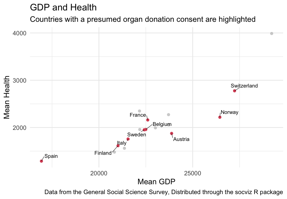<!-- --> --- # Practice Use the mpg dataset * Group by manufacturer * Compute the mean highway `hwy` and mean `displ` * Plot the relation between these means. Plot points and label the manufacturer of each point. --- class: inverse-blue middle # ggforce Please follow along --- # Annotating groups of points Consider using any of the following from **ggforce** to annotate specific points * `geom_mark_rect()` * `geom_mark_circle()` * `geom_mark_ellipse()` * `geom_mark_hull()` --- # Examples ```r library(palmerpenguins) library(ggforce) penguins %>% drop_na() %>% # Can't take missing data ggplot(aes(bill_length_mm, bill_depth_mm)) + * geom_mark_ellipse(aes(group = species, label = species)) + geom_point(aes(color = species)) + * coord_cartesian(xlim = c(28, 62), ylim = c(13, 23)) + guides(color = "none") ``` --- class: middle <!-- --> --- # Limit to a single group ```r penguins %>% drop_na() %>% ggplot(aes(bill_length_mm, bill_depth_mm)) + geom_point(aes(color = species)) + geom_mark_ellipse(aes(group = species, label = species), * data = filter(drop_na(penguins), * species == "Gentoo")) + coord_cartesian(xlim = c(28, 62), ylim = c(13, 23)) ``` --- class: middle <!-- --> --- # Switch to hull Note - requires the **concaveman** package be installed ```r penguins %>% drop_na() %>% ggplot(aes(bill_length_mm, bill_depth_mm)) + geom_point(aes(color = species)) + * geom_mark_hull(aes(group = species, label = species), * data = filter(drop_na(penguins), * species == "Gentoo")) + coord_cartesian(xlim = c(28, 62), ylim = c(13, 23)) ``` --- class: middle <!-- --> --- # Change expand ```r penguins %>% drop_na() %>% ggplot(aes(bill_length_mm, bill_depth_mm)) + geom_point(aes(color = species)) + geom_mark_hull(aes(group = species, label = species), * expand = unit(1, "mm"), data = filter(drop_na(penguins), species == "Gentoo")) + coord_cartesian(xlim = c(28, 62), ylim = c(13, 23)) ``` --- class: middle <!-- --> --- # More in-depth annotations First create a description ```r penguins <- penguins %>% mutate(desc = ifelse(species != "Gentoo", "", "During deep dives, gentoo penguins reduce their heart rate from 80 to 100 beats per minute (bpm) down to 20 bpm. Gentoo penguins use nesting materials ranging from pebbles and molted feathers in Antarctica to vegetation on subantarctic islands. Gentoos are the third largest penguin, following the emperor and king.")) ``` --- # Now add as a description ```r penguins %>% drop_na() %>% ggplot(aes(bill_length_mm, bill_depth_mm)) + geom_point(aes(color = species)) + geom_mark_ellipse(aes(group = species, label = species, * description = desc), data = filter(drop_na(penguins), species == "Gentoo"), * label.fill = "#b3cfff") + coord_cartesian(xlim = c(28, 62), ylim = c(13, 23)) ``` --- class: middle <!-- --> --- # Similar We can also just add a textbox through **{ggtext}** ```r txtbox <- tibble( bill_length_mm = 23, bill_depth_mm = 16, lab = '"They may all waddle around in their tuxedolike feathers, but the penguins of the Antarctic Peninsula are not equal in their ability to adapt to a warming climate. While the populations of the Adélie and chinstrap penguin species are currently declining, the gentoo species is increasing. But this has not always been the case, according to a recent study published in the journal Scientific Reports." - Scientific American' ) ``` --- ```r penguins %>% drop_na() %>% ggplot(aes(bill_length_mm, bill_depth_mm)) + geom_point(aes(color = species)) + ggtext::geom_textbox(aes(label = lab), data = txtbox) + coord_cartesian(xlim = c(17, 62), ylim = c(13, 22)) ``` <!-- --> --- # Last bit The **ggforce** package is well worth exploring more. See [here](https://z3tt.github.io/OutlierConf2021/) for a nice walkthrough that has good data viz and uses some of the **ggforce** functions (as well as illustrating a few other cool packages) --- class: inverse-blue middle # Saving plots And potentially making additional edits --- # Raster/Vector We'll talk about this again when discussing maps, but it relates to saving as well. **Raster** (also called bitmap) stores images as a grid of points (pixels) **Vector** store instructions for how the figure should be drawn. Image is redrawn as it is printed/displayed on screen .footnote[see [Wilke, Chapter 27](https://clauswilke.com/dataviz/image-file-formats.html) for more information.] --- # Differences .footnote[Image from Wilke]  **Vector graphics**: pdf, eps, svg **Raster graphics**: png, jpeg, tiff, gif --- # Downsides to vector graphics * Possible differences in appearance between displays (programs, computers, etc.) * Very large/complex figures can balloon to giant file sizes and be slow to render --- # Lossy/Lossless compression * Lossless - guarantees image is, pixel for pixel, identical to original + png and tiff use lossless compression * Lossy - accepts some minor image artifacts to reduce size + jpeg -- ### Practical advice Export to PDF -- If that won't work (web), use png -- If the file size ends up being too large, go with jpeg --- # Practice * Create a plot * Save it as a PDF with `ggsave()` Note, the first argument to `ggsave()` is the `path`, so you could do something like `ggsave(here::here("myplot.pdf"))` You can also specify the width/height. By default, it will save the last plot you produced, but you can also specify it with `plot = ` argument, where you pass an object that has the plot --- # Modifications I rarely do this, but if I do, I tend to use [Inkscape](https://inkscape.org/), which is free. [demo] --- class: inverse-red middle # Compound figures Please follow along --- # Options My favorite: [{patchwork}](https://patchwork.data-imaginist.com/index.html) -- Others: * [{cowplot}](https://wilkelab.org/cowplot/index.html) * [{ggpubr}](https://github.com/kassambara/ggpubr/) * [{gridExtra}](https://cran.r-project.org/web/packages/gridExtra/index.html) --- # Example * First, create two plots ```r p1 <- ggplot(mpg, aes(displ, hwy)) + geom_point(aes(color = factor(cyl))) + geom_smooth() + scale_color_OkabeIto() p2 <- ggplot(mpg, aes(factor(cyl), hwy)) + geom_boxplot(aes(fill = factor(cyl))) + scale_fill_OkabeIto() ``` --- # Side by side ```r library(patchwork) p1 + p2 ``` <!-- --> --- # Collect legends ```r p1 + p2 + plot_layout(guides = "collect") ``` <!-- --> --- # Stack vertically ```r p1 / p2 + plot_layout(guides = "collect") ``` <!-- --> --- # Add a third plot ```r p3 <- mpg %>% group_by(manufacturer) %>% summarize(mean_mpg = mean(hwy, na.rm = TRUE)) %>% mutate(manufacturer = fct_reorder(manufacturer, mean_mpg)) %>% ggplot(aes(mean_mpg, manufacturer)) + geom_col(fill = "#25B6EE") + theme(axis.text.y = element_text(size = 12)) ``` --- # Put scatter on bottom ```r (p1 + p3) / p2 + plot_layout(guides = "collect") ``` <!-- --> --- # Overall title ```r (p1 + p3) / p2 + plot_layout(guides = "collect") + plot_annotation("Some cool plots") ``` <!-- --> --- # Tags ```r (p1 + p3) / p2 + plot_layout(guides = "collect") + plot_annotation("Some cool plots", tag_levels = "a") ``` <!-- --> --- # Insets ```r p3_small_txt <- p3 + theme(axis.text.y = element_text(size = 8), text = element_text(size = 8)) p1 + inset_element(p3_small_txt, 0.6, 0.6, 1, 1) ``` 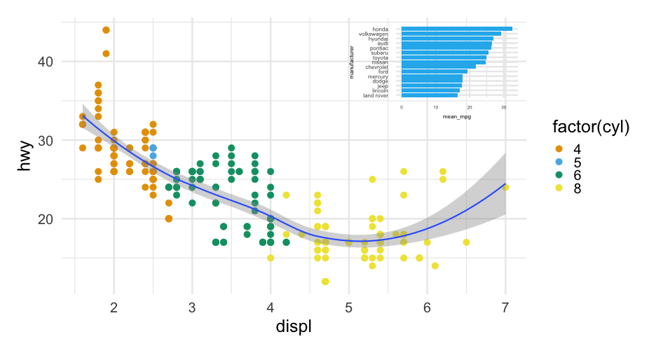<!-- --> --- class: inverse-red center middle # Themes (quickly) --- 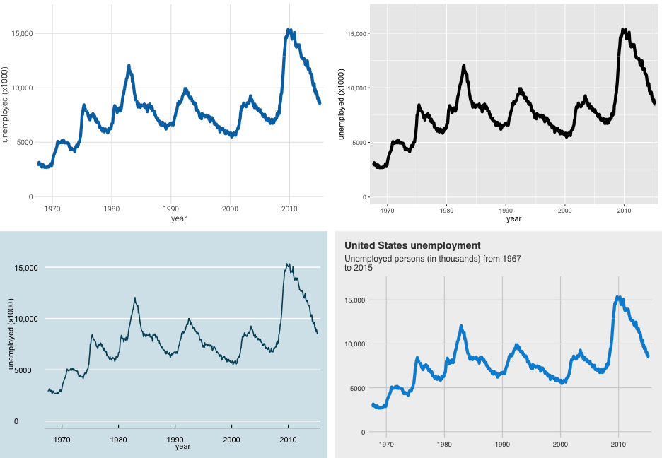<!-- --> --- # ggthemes * Good place to start. All sorts of themes. * Includes color scales, etc., that align with themes * You can even conform with other software + fit into an economics conference with `theme_stata` See the themes [here](https://yutannihilation.github.io/allYourFigureAreBelongToUs/ggthemes/) --- # BBC The BBC uses ggplot for most of its graphics. They've developed a package with a theme and some functions to help make it match their style more. See the repo [here](https://github.com/bbc/bbplot) Their [Journalism Cookbook](https://bbc.github.io/rcookbook/) is really nice too --- background-image: url(https://github.com/bbc/bbplot/raw/master/chart_examples/bbplot_example_plots.png) background-size: contain --- # ggthemeassist * Another great place to start with making major modifications/creating your own custom theme * Can't do everything, but can do a lot * See [here](https://github.com/calligross/ggthemeassist) [demo] --- # `theme()` for everything else * You can basically change your plot to look however you want through `theme` * Generally a bit more complicated * I've used ggplot for *years* and only really now gaining fluency with it --- # Quick example ### From Lab 3 ```r library(fivethirtyeight) g <- google_trends %>% pivot_longer(starts_with("hurricane"), names_to = "hurricane", values_to = "interest", names_pattern = "_(.+)_") landfall <- tibble( date = lubridate::mdy( c("August 25, 2017", "September 10, 2017", "September 20, 2017") ), hurricane = c("Harvey Landfall", "Irma Landfall", "Maria Landfall") ) ``` --- ```r p <- ggplot(g, aes(date, interest)) + geom_ribbon(aes(fill = hurricane, ymin = 0, ymax = interest), alpha = 0.6) + geom_vline(aes(xintercept = date), landfall, color = "gray80", lty = "dashed") + geom_text(aes(x = date, y = 80, label = hurricane), landfall, color = "gray80", nudge_x = 0.5, hjust = 0) + labs(x = "", y = "Google Trends", title = "Hurricane Google trends over time", caption = "Source: https://github.com/fivethirtyeight/data/tree/master/puerto-rico-media") + scale_fill_brewer("Hurricane", palette = "Set2") ``` --- 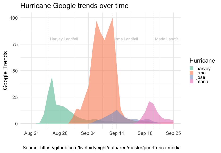<!-- --> --- ```r p + theme( panel.grid.major = element_line(colour = "gray30"), panel.grid.minor = element_line(colour = "gray30"), axis.text = element_text(colour = "gray80"), axis.text.x = element_text(colour = "gray80"), axis.text.y = element_text(colour = "gray80"), axis.title = element_text(colour = "gray80"), legend.text = element_text(colour = "gray80"), legend.title = element_text(colour = "gray80"), panel.background = element_rect(fill = "gray10"), plot.background = element_rect(fill = "gray10"), legend.background = element_rect(fill = NA, color = NA), legend.position = c(0.2, -0.1), legend.direction = "horizontal", plot.margin = margin(10, 10, b = 20, 10), plot.caption = element_text(colour = "gray80", vjust = 1), plot.title = element_text(colour = "gray80") ) ``` --- 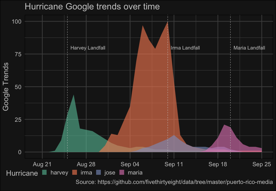<!-- --> --- class: inverse-green center middle # Next time ### Visualizing uncertainty Homework 2 is also posted